Finding a better option to provide the best service.
The owner at the bakery painted by a customer
🥐 Client: La Francesita
Bakery located in The Woodlands Tx a family-owned French bakery that offers a taste and vibes of a Parisian Cafe within the local community.
Timeframe: 3 weeks
My Role: UX Researcher and Project Manager
Methods: User Interviews, Survey Screeners, Stakeholder Interviews, Hours of Observation, Usability Testing, Prototyping, Heuristic Evaluation, Competitive Analysis, Journey maps and Persona creation
Tools: Figma, Miro, Trello, Google Drive, and Zoom.
🥧Project Overview
La Francesita’s owner wanted to increase their engagement through their website by providing better online guidance to users.
To redesign this website, we thought we would be updating a lot of the bakery’s information to ensure accuracy, and also making it more accessible to the online crowd, who are frustrated by the discrepancies between the menu and the store itself.
-
Description Problem: As of right now, their website is not an accurate reflection of the services the bakery can provide (such as Delivery and Curbside), and menu items displayed on the website are not correct to what is currently in stock.
Solutions: In order to make the bakery more accessible for the end user - the customer - the online site needs to better reflect the service, leading to a more streamlined process for business and the customers.
-
Goals:
Accurately reflect La Francesita’s goods and services.
Streamline access to online users
A form to make in person service more smooth with the help of the website features to aliviate frustrations
Methodology:
General screener survey
Stakeholder & customers in-person interviews
In-person Observation of customers and staff service
Introduction
Being there physically to have breakfast several times we noticed that there were frustrations with customers struggling to get Palmiers (La francesita’s star item) and because they were not ready to sell people had to leave disappointed. At that moment we knew we found a problem to solve, that could help the owner to grow her business and also the customers to have a better experience.
We approached Yaz, the owner and our main stakeholder, to present the idea of the redesign. She was very excited, a passionate business owner that had moved the bakery across continents. She knew she wanted to find a new way to deliver a better service because she was struggling being short with staff and not having an online presence and time to maintain it. She needed our help.
Methodology
Competitive Analysis
Heuristic Evaluation
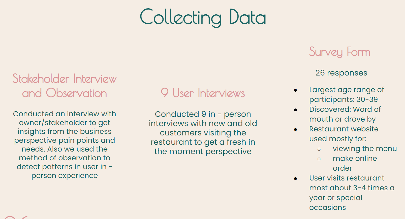
Stakeholder Interview
Survey
User interviews in-person
6 Hours of Observation
Affinity Diagram
Persona & Customer Journey
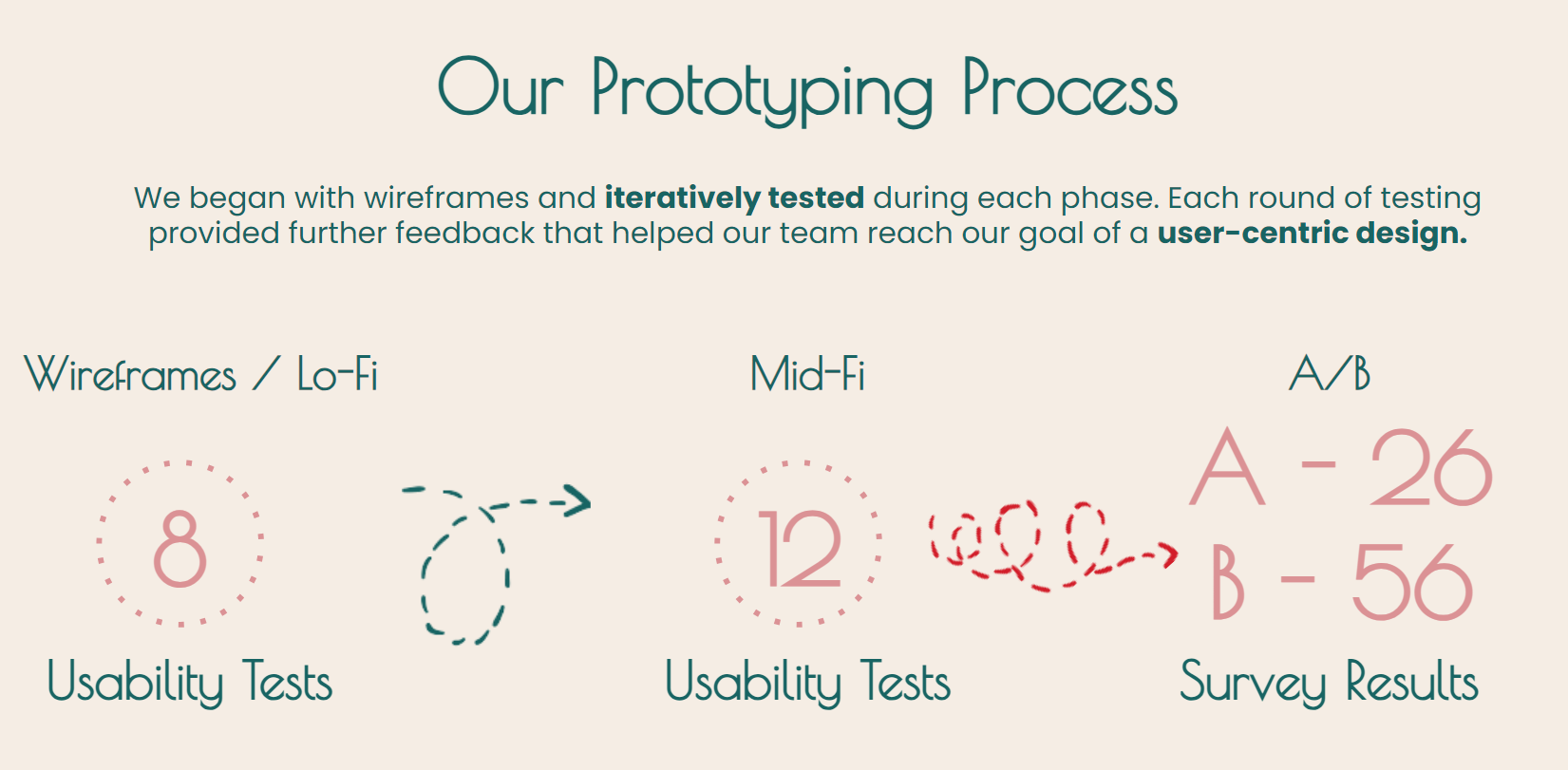
Usability Tests
A/B Testing
Competitive Analysis
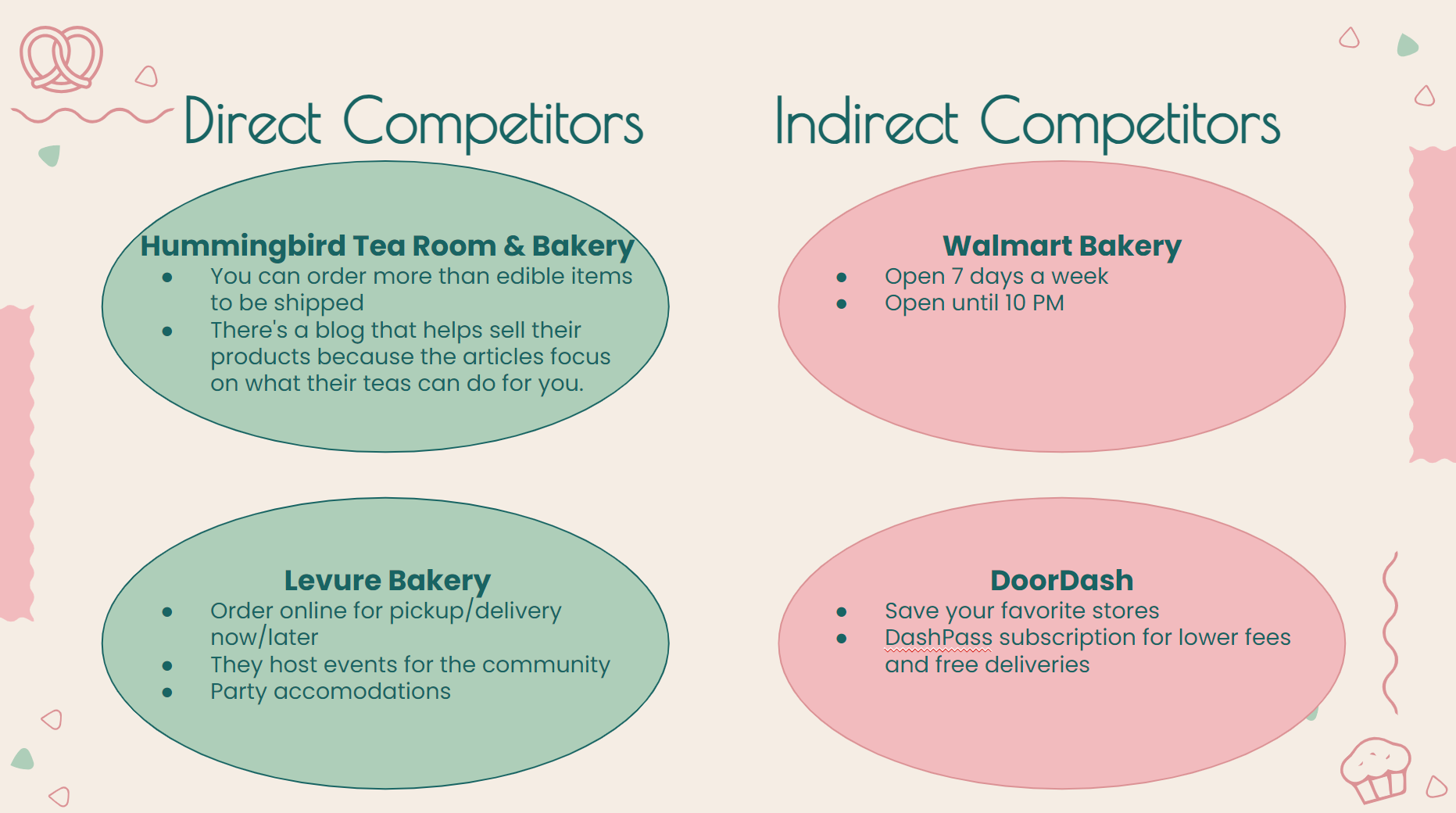
In our analysis of the competition, we drew attention to the different advantages other bakeries have over La Francesita, all of which have online ordering in particular.
Analyzing the wants and needs of our Stakeholder and our Users, we were able to determine what we needed to fulfill: Being able to view the menu online, A place to connect with their community, and quick and efficient service. We labeled this intersection of goals The Sweet Spot.
Part of the Affinity Diagram we created after our interview + video notes to extract and fin patterns
With our sweet spot identified, it was easy to find main pain points for both the business and the customers: Supply not meeting the demand, lack of visuals in the menu causing a lack of trust, and long wait times leading to stressed staff and angry customers.
After our research phase, it was time to figure out our solutions….
We put everything we learned from our interviews into perspective, and constructed our user persona, Rick. He’s a family-man who enjoys new experiences; especially in his new home. He loves the immersion of themed restaurants, but hates when they’re too crowded and have long lines.
Here’s an experience we could see our user, Rick, having before we got in the mix.
He hears about the delicious Palmiers and decides to learn more about them on the website. Unfortunately, he doesn’t learn much but decides to order one anyway. With the Palmiers out of stock again, Rick becomes frustrated after learning the only way to reserve one is over the phone
Click in the image down below to see: User Persona & Current Customer Journey ⬇️
Heuristic Evaluation
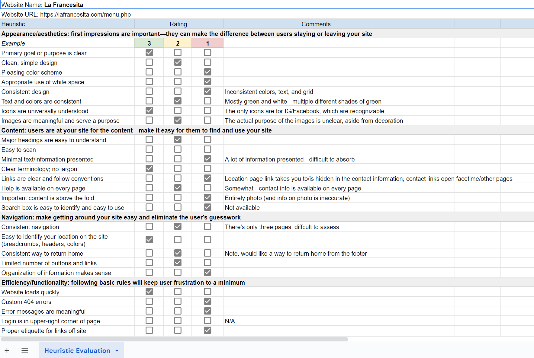
Performed a heuristic evaluation of the website to determine what we could do to improve his experience next time.
We found that the theme was inconsistent, the menu was difficult to absorb, and the hours were hard to understand.
Checklist
We started with a detailed revision of the old website to mark relevant points of frustation and inconsistent patterns.
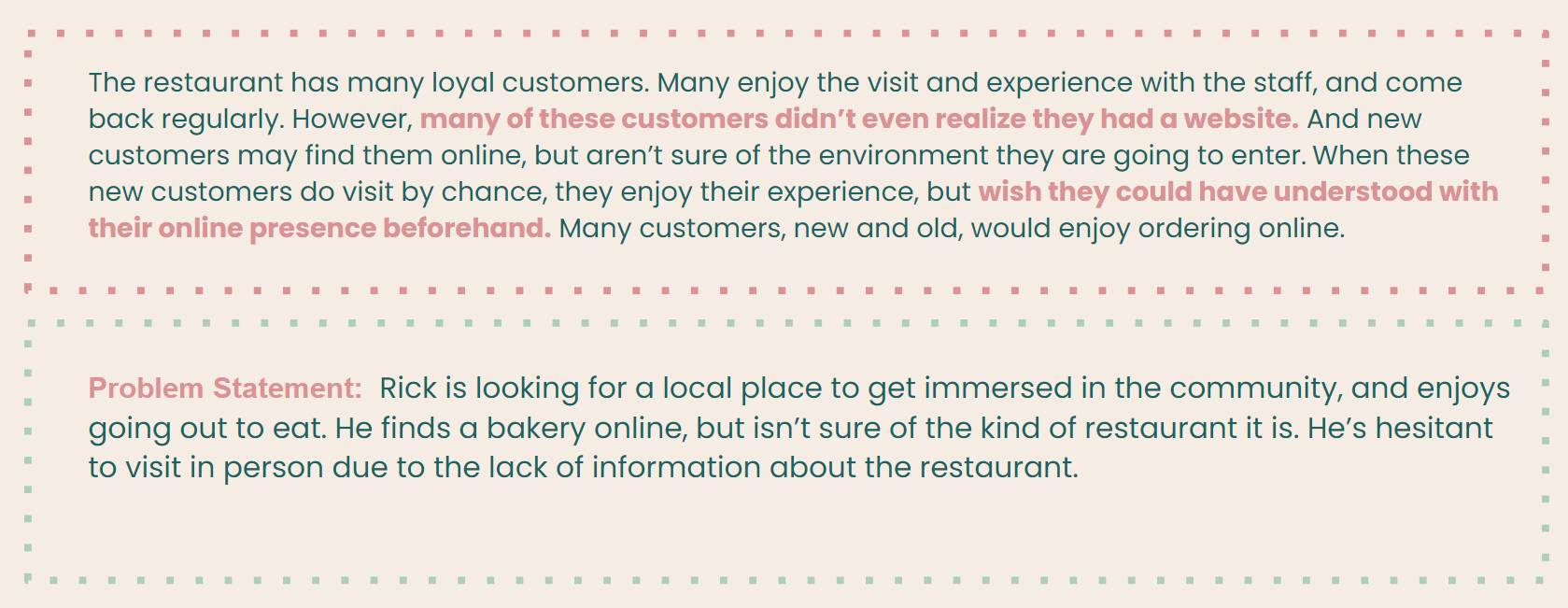
User Insights
Because of these insights, we know that our adventurous user, Rick, would be hesitant to visit the bakery due to the lack of information provided on the website.
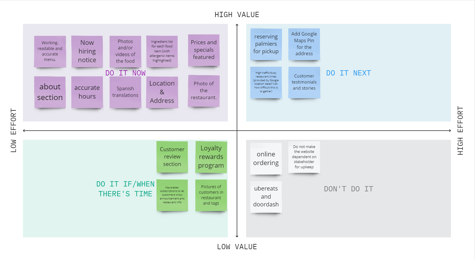
So, with that information, and using a prioritization matrix, we conceptualized features that we knew our user, Rick, would appreciate. We also made sure they were achievable for us and aligned with our stakeholder’s needs and availability to provide the online service.
Some of our top priorities include adding more photos to entice future customers, updating the hours so they are accurate, and of course, creating a space for Palmier reservations.
Since the Palmiers are the restaurant’s star items, we knew we had to fix the problem of customers not knowing if and when they were available.
We started off with having the option to reserve Palmiers within the same day, but after discussing with the stakeholder, Yaz, we were informed that 2 days in advance would be best for the shop.
Every step of the way, we tested and listened to feedback from users. We adjusted placement of icons, we made changes to the navigation to make it more intuitive. And we added multiple routes to find the page you’re looking for.
There were some key elements we focused on with this build. A big one being breakpoints. We wanted a website that was responsive across multiple platforms and consistent throughout. But more than that, we wanted to create a website that helps foster the joy people feel with the bakery and captures the French vibe they’ve worked hard to create. Which is why you’ll see a lot of visual elements inspired by French cafes and joyful little microinteractions
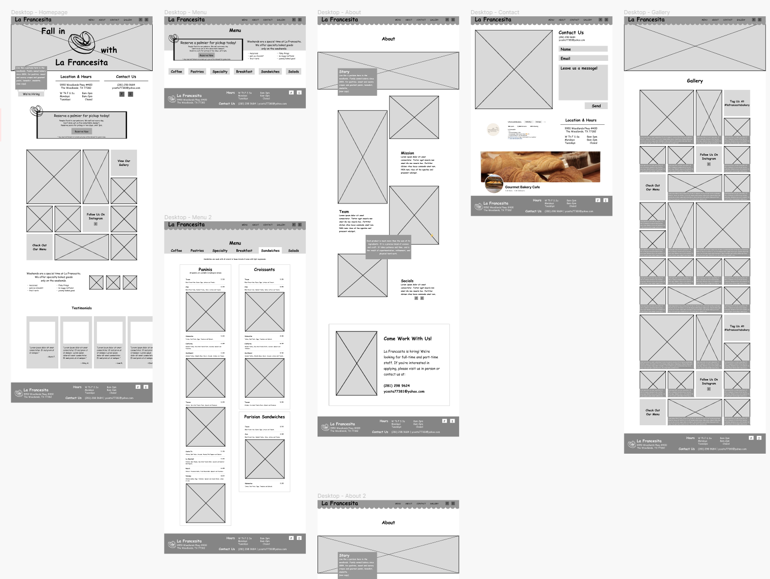
We needed to up their original website’s game. We added features it was lacking such as an about page and gallery. We let customers know what specialty pastries are only available on the weekends to prevent disappointment. We literally hung out a shingle to signal that they are hiring. We displayed the bakery’s hashtag so customers could drive social media engagement without much effort from the owner herself. And of course we built our palmier reservation page and promoted it throughout the site. Finally, we improved crucial features. The menu is now broken into categories, making it much more digestible. We included photos so customers can see what they’re ordering. The homepage got an overhaul too. Important information is prioritized and navigation architecture was created and implemented.
Wireframes ideation
This all resulted in a complete website that functions as both an entryway into the bakery’s experience and as a tool for making their in-person visit better:
CLICK HERE TO VISIT SITE
Added Features:
New & improved menu ( more visual and easier to read adding tabs to navigate options)
Reserving a Palmier ( allows customers to reserve an item that frequently sells out)
About the Business (learn more ans connect with the story of the owners and staff)
Hiring Notice (Our stakeholder needed more staff)
Customer Testimonials (positive reviews from loyal customers to bring new ones)
Specialty Items (Items offered at specific times)
Next Steps for La Francesita:
Spanish translations for the website and menu
Reward points program for loyal customers
Display for busy/high traffic times in the restaurant

